The Mysterious Tator
Posted by palabomeno on Jun 13, 2024
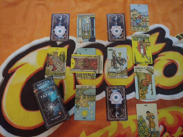
I consider myself to be kind of an aficionado of weird and obscure tarot. I like to collect decks that are straight up bad - the stupid tie-in decks, the ones aimed at kids, and especially the ones that are just badly made to sell to idiots for his lower prices possible. Today, I may be showing you one of the worst tarot decks I’ve ever experienced in my life, and when I tell you its name, you will believe me how bad it is right away: My copy of the Mysterious Tator.
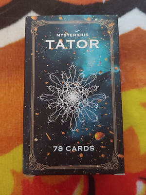
Yes, that is its name.
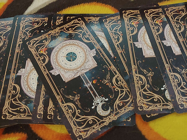
The cards and card box themselves are so incredibly bad. The art is really bland and uninspired, and the cards themselves suck, suck, SUCK to use. They are made of a way too thick and heavy paper stock that is almost inflexible, and it’s almost impossible to shuffle these. Even doing a basic riffle shuffle caused my hands to hurt! With my first reading using these, I noticed that like four cards had even gotten stuck in the deck box!
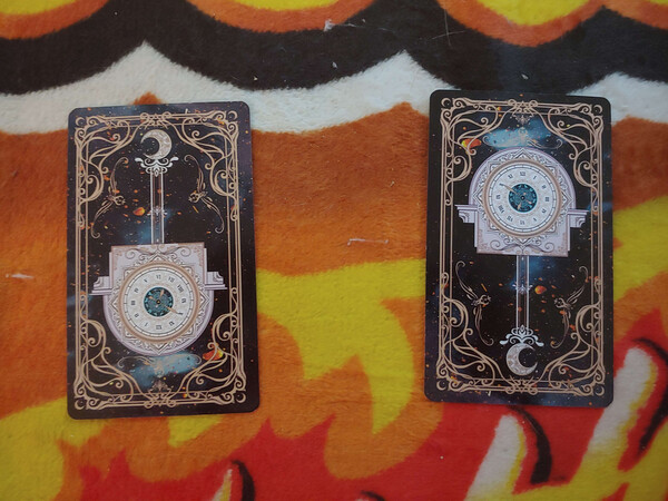
As well, the card backs are asymmetrical, informing you if the card you’re about to draw is upright or reversed. This doesn’t actually affect your reading, because once the cards are in their final shuffled state they’re going to be the same no matter how you draw them, it might get in your head a little that you know the next card is going to be a reverse.
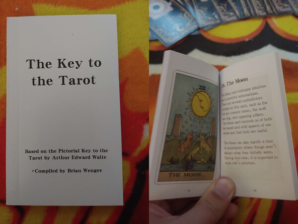
The included booklet isn’t very comprehensive but does have pretty full color images in it. I absolutely would not use this book as your first guide to the tarot with your first deck, though! The little booklet that comes with the official Waite-Smith deck is much more comprehensive, using quotes actually from A.E. Waite himself. The booklet also does not have any meaning on reverse cards. Perhaps that’s why it has asymmetrical backing, this deck is intended for upright use only?
The printing of the cards faces is actually pretty good looking. It’s got kind of faded sepia toned full border illustrations of a copyright-friendly version of the Waite-Smith tarot, that are printed in good quality with nice green tone style finish. It’s kind of like an old fashioned comic book look… almost.
The weightiness of the cards feels pretty good when they’re in your hand but… It may sound stupid, but these cards make your hands tired. They’re just too big and too heavy, even compared to how large tarot cards are supposed to be.
The energy this deck gave me was a very needy one, one of a deck really desperate to be liked, that I did not find appealing. It kind of made me feel bad for it, but not bad enough to want to hang out with it. That kind of person. This deck gets picked last at baseball.
This is possibly the most insincere, money grubbing oriented tarot deck in my collection, possibly ever. Even the Miss Cleo deck is more sincere about using the tarot than this deck. Using this makes me feel like I’m a fortune teller in a sitcom, slapping down a death card and everybody starts screaming.
Overall I would not recommend this deck to anybody except the most serious of collectors, who want to own one of the weirdest tarot decks in existence. This decks oddness is because of its utter mediocrity, the absolute lowest effort that could be put into producing a tarot deck. It’s the Mysterious Tator! They literally couldn’t even spell it right on the box!
Categories: occult