The Housewives Tarot
Posted by palabomeno on Sep 1, 2018
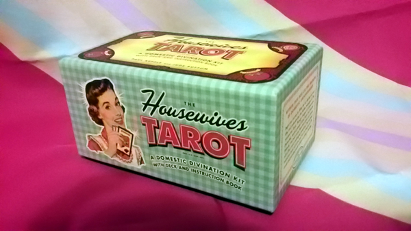
The Housewives Tarot is a deck published by Quirk Books and designed by Paul Kepple and Jude Buffum of Headcase Design. It was first printed in 2004, and has since been followed by a semi-sequel, The Zombie Tarot. The deck is inspired by the aesthetics of 50s America, with martini-sipping housewife culture. The deck’s “backstory” involves the mystic Madame Marlena, an otherwise unassuming housewife who introduces the tarot to her group of friends as a way of life.
Here’s my thoughts on the deck of the so-called Marlena, under the cut.
First of all, this tarot deck was given to me as a gift. I did not pay for it myself, but neither was I compensated by the publishers of this deck for this review.
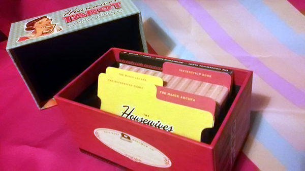
The deck’s box is a fantastic draw, and introduces the thematics of the deck beautifully well before you even touch the cards. It is designed to resemble an old-fashioned recipe box, complete with little dividers for the major arcana, minor arcana, and booklet. The box itself is high-quality, thick cardboard and is printed both on all sides. It is a vacuum-seal kind of box, so opening it and closing it is a very satisfying experience.
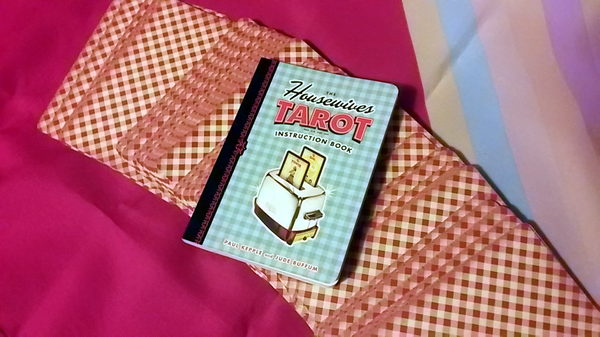
The real draw to this deck is the booklet included. Fully bound and in color, it blows the typical white paper pamphlets that many tarot decks come with out of the water. It comes complete with not just an interpretation of each card in the deck, but a small story that lays out the aforementioned lore and a few custom spreads designed to fit the deck’s thematics. The spreads start out with extremely simple (a one-card draw and a three-card past/present/future reading) to highly complex (a thirteen card spread in the shape of a martini glass).
The cards are very well made, with a nice thick and sturdy cardboard. Each card is gorgeously printed with a very clean image. The deck uses the traditional four suits and major arcana, with each suit reinterpreted into a common household item. The swords are knives and other household sharp objects; the cups, drinking glasses; wands are mops and brooms; and the pentacles are dishes. Each suit is color coded on its border as well: swords red, cups blue, pentacles green, and wands brown, with the Majors in black as well.
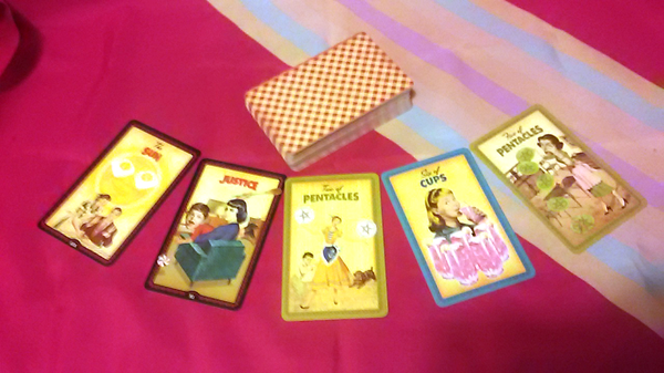
Each of the cards are designed with a midcentury photocollage style that frequently verges on the surreal. Most of the cards are pretty typical, but some (such as the Queen of Cups and the Three of Pentacles) are decidedly bizarre. Being a humorous deck, the light hearted artwork adds to the theme of “20th century reconstructionism” and makes each card a delight to look at. My personal favorite card is The Fool, which depicts an absent-minded woman walking off the roof of her own home.
The inspiration draws heavily from the standard Smith-Waite tarot, but takes a few liberties of its own. A few of the card interpretations are different. The Four of Cups is listed as being about avoiding overindulgence, and is portrayed as a woman turning down a humongous fourth glass of alcohol after drinking three. When reading the Smith-Waite, I normally see this card as missed opportunities and solutions from strange places. The Nine of Wands is also changed, from being about defensiveness to overcoming obstacles.
I would recommend this deck for either absolute beginners looking for a fun novelty, or long-term tarot readers wanting to expand their collection. This deck isn’t suited for people who are trying to get into “seriously” reading the tarot. Though the art is clever and the booklet informative, the contents are not particularly suited for in-depth readings, and the altered meanings might make it confusing for newcomers discovering other decks’ interpretations. These cards are great for people wanting an interesting way to get into collecting tarot cards, but I would recommend a standard Smith-Waite deck or a Marseilles deck for someone who wants to read seriously.
That being said, these would be fantastic to pull out at a group gathering to introduce others to the tarot! A reading with these is guaranteed to be a light, fun, and eye-opening affair. I don’t have a lot of decks in my current collection, so The Housewives Tarot is an excellent addition. It’s without a doubt the most impressive deck; at the price point it was being sold for, I get a lot more in terms of packaging and detail. Most other decks come with flimsy packages and little black and white booklets held together with a single staple. This deck has clearly been designed as an art project first, and a deck for reading second.
Of course, me being me I’m going to take some issue with two men designing a deck designed to memorialize being a white woman during the 50s. The 50s were no idyllic period of sipping martinis while being a domestic goddess! There are no women of color whatsoever in this deck, let alone even the slightest hint of LGBT representation. It’s a very conservative minded deck by nature. These are some pretty serious reasons to avoid it, but I think the deck’s tongue-in-cheek humor is understandable overall.
In the end, I think the Housewives Tarot is a great buy for anyone looking to expand their tarot card collection. I wouldn’t recommend it for anyone who is really engaged with the serious side of cartomancy, but it’s a good laugh in a gorgeous package.
Categories: occult